What’s in a Name? Design Process and Inspiration for The Station on Washington
The Station on Washington provided endless possibilities and excitement, but the interior concept was one that fit right into place with ease.

Interior designers always leave project kick-off meetings with a great number of ideas and approaches swirling around in their minds. The Station on Washington provided that same sense of endless possibilities and excitement, but the interior concept was one that fit right into place with ease.
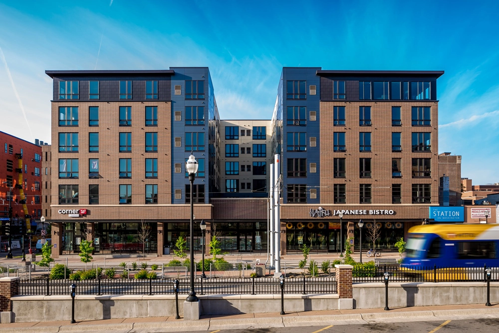
The project name and its location directly on the light rail’s Washington Avenue transit mall were the main drivers in the personality of this space. Our interiors group wanted to create a modern and sophisticated design, while highlighting a strong emphasis on rail transportation. It was important to us that the elements not appear too literal.
The acoustical ceiling baffles in the main lobby lounge area are one example of this nod to rail transportation. This installation represents a railroad track in its simple layout and spacing. With the lounge being entirely porcelain tile flooring, the baffles also serve as a decorative way to improve acoustics.
Another example of the rail concept is the vinyl wall graphic component in the entrance that takes on the look of a common subway map with small puck-lights representing where the stops would be. The map lines and “stops” were thoughtfully placed around otherwise less-attractive necessities such as fire extinguisher cabinets and wall devices. They also serve a functional purpose of illuminating the main path of travel.
The introduction of metal and reclaimed barn wood kept the design contemporary while also maintaining a sense of warmth. The lobby security desk is faced with corrugated metal for an industrial feel (imagine a box car), and the vibrant blue and red accents lead guests and residents into the amenity spaces.
Lastly, the signage and wall graphics brought the space to life by portraying the rail transit theme in a classic form. The large wall graphics were printed in black and white to evoke a sense of history and timelessness. Most of the permanent finish materials remained neutral, but we wanted the artwork and signage to be the accents in the space.
Often the small details and accents tie the interior together, giving the space its final mark. Try to find the additional design elements in the photos above that speak to The Station name.
Article Type: Blog Post
Topics: Minneapolis | Design


